From Old to New in 4 Steps
We have waited 3 years for today, or rather worked intensively towards it. With the new administration and task management we have now released the last big milestone of the new user interface. The modernization of the user interface is now complete.
As with the first three milestones of the new user interface, we have tried to design the new UI in such a way that you can find your way around as usual.
What do I need to know?
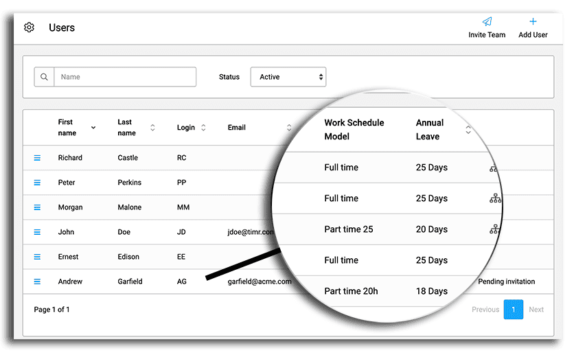
1. Better Overview

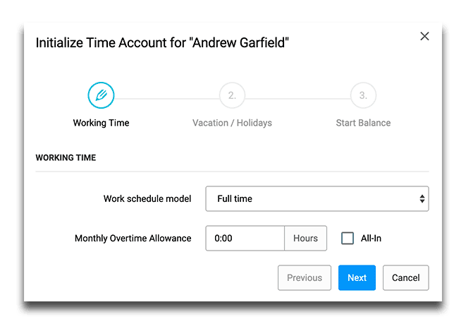
2. Simpler Time Account Initialization

Looking back and into the future
When we started modernizing the user interface 3 years ago, our goal was to make timr more appealing and modern. Also from a technical point of view the modernization was necessary to be able to develop new functions easier and faster with current web technologies. The most important concern for us was that all employees could continue to find their way around without having to re-learn/train at every step. In May we were able to publish the first major innovation based on our new technology with the leave requests.
From now on we can use all resources to work on new functions and detail improvements. So look forward to what’s coming and let us know via our support what you are still missing at timr!
